Coca-Cola's
Planet over plastic
Coca-Cola’s red is one of the most recognizable colors in the world. Planet Over Plastic asks what happens when that red starts turning green, using Coca-Cola’s own visual identity to imagine a future where one of the world’s biggest beverage brands puts biodegradable packaging, and the planet, first.

Project Overview
Coca-Cola doesn’t have an awareness problem. It has a waste problem. Planet Over Plastic turns the brand’s iconic red green, using the world’s most recognizable identity to make a visible commitment to biodegradable packaging and a less disposable future.
- Audience
- Young consumers who expect the brands they buy from to make sustainability visible.
- Focus
- Making sustainable packaging impossible to ignore.
- Context
- Advertising Course Project
02 / Strategic Thinking
Problem → Insight → Idea
The Challenge
Coca-Cola’s sustainability efforts are easy to overlook when its packaging still looks and feels disposable.
The Insight
Coca-Cola’s plastic problem is almost impossible to picture until you learn its bottles could wrap around the Earth nearly 1,500 times. At that scale, small changes aren’t enough.
The Idea
Turn Coca-Cola’s most iconic assets into proof of change. Rethink the packaging, flip red to green, be the difference.
03 / Campaign System
The Work
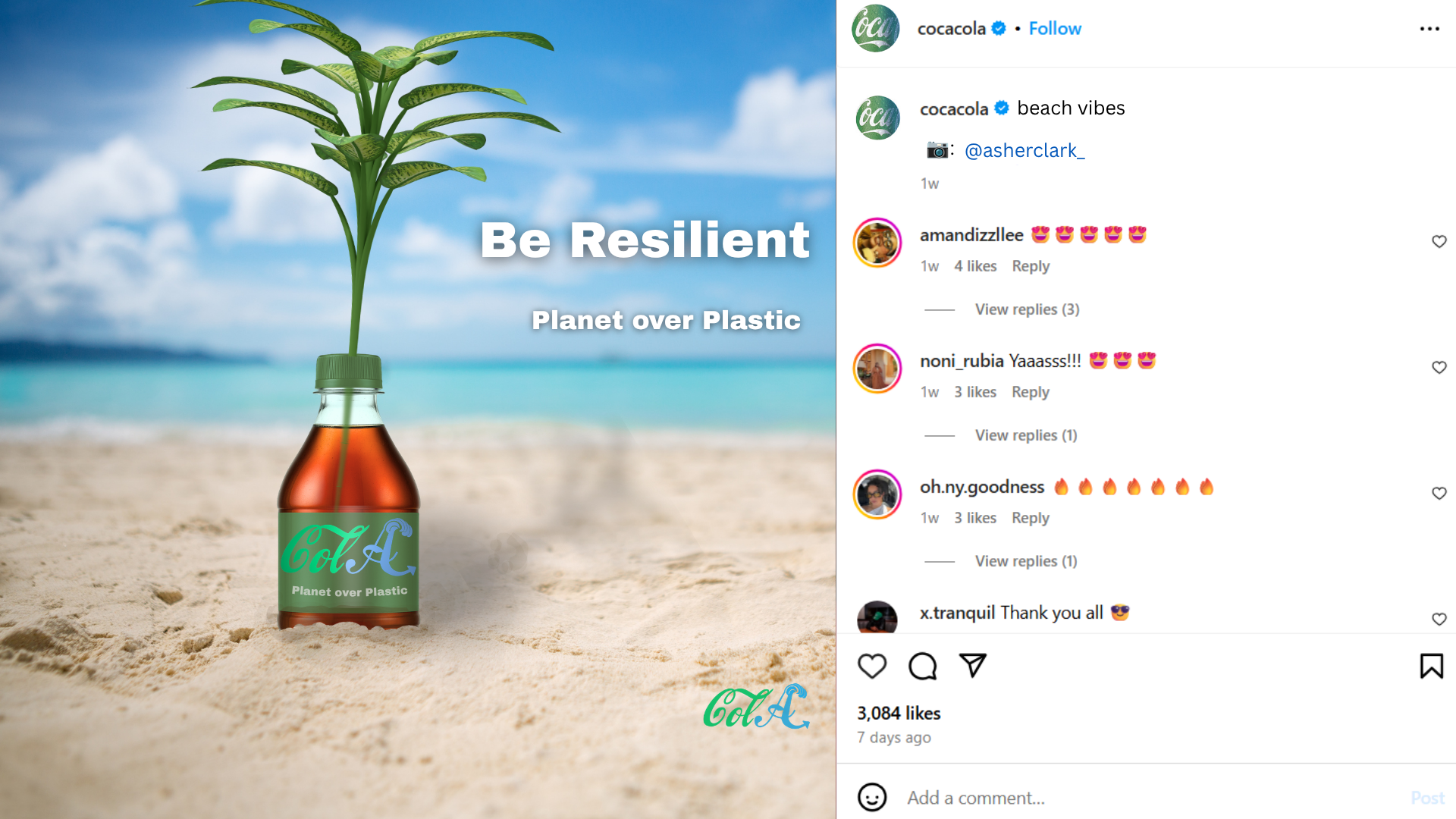
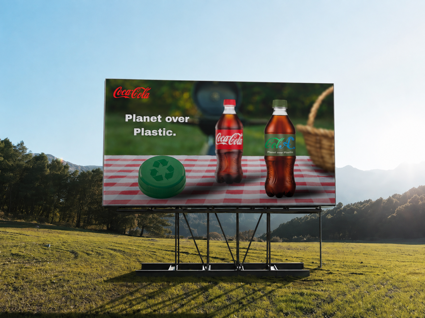
A green-and-blue identity reframes Coke around land and water, while plantable packaging turns each bottle from something disposable into something that can grow.
 View image ↗
 View image ↗
 View image ↗
 View image ↗
 View image ↗
 View image ↗
 View image ↗